
Canva: AI Photo & Video Editor review
 Analysis by GetAllApps
I find Canva most useful when I have an idea but not the time or design skills to build everything from scratch. On a phone, I can start with a layout, add my own text and images, and shape a finished-looking social post, invitation, short video, or presentation. The trade-off is that the experience depends on more than a good template: browsing, editing, and saving can all feel different when a connection is slow or unreliable.
That makes Canva a handy companion for quick creative work, but not an automatic replacement for every photo editor or professional design tool. I’d recommend it to people who want an approachable way to make visual material on the move. If you need precise, layer-by-layer control or regularly work without internet access, I’d consider whether a more specialized app fits your routine better.
When a connection is part of the creative process
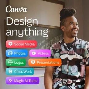
Canva is an art and design app from Canva, and its central appeal is the way it brings layouts, visual elements, and editing into one place. Instead of beginning with a blank canvas, I can choose a format that suits the job and adapt it. That is especially helpful when the task is practical rather than artistic: making a readable event announcement, putting together a simple menu, or preparing a polished-looking post before sharing it.
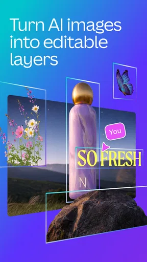
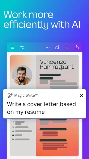
The app’s store summary points to prompt-based generation for videos, photos, and elements. In use, that kind of tool is best thought of as a way to get a starting point, not a guarantee that the first result will be ready to publish. I’d expect to review the output, adjust it to fit the intended message, and check that it works with the rest of the design. A generated image can save time brainstorming, but it still needs a human eye for relevance and composition.
Network quality matters most when I’m exploring possibilities rather than making a small edit to a design I already understand. Browsing templates and visual assets can involve loading more choices, while a prompt-based creative step naturally requires the app to do work beyond placing text on a page. If I’m on an unstable connection, I’d keep the task modest: decide on the format first, avoid repeatedly changing direction, and leave room to check that the final result has saved before I close the project.
For a real everyday example, imagine I’m asked to make a last-minute notice for a community event while away from my desk. I can pick a suitable layout, replace the sample wording, add the time and location, and make the important details visually clear. The phone workflow is convenient, but I would not leave proofreading until the final moment. A small screen makes it easy to overlook a typo or misaligned line, and a weak connection is a poor time to experiment with lots of extra assets.
Templates are a shortcut, not a finished decision
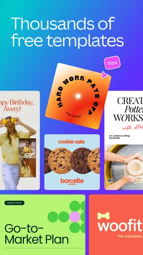
One useful habit is to choose a template based on the information hierarchy, not just its colors. If the event time, product name, or call to action is the most important detail, I look for a layout that gives it space. Then I change the wording before getting absorbed in decorative choices. This reduces the chance of ending up with a visually attractive design that communicates the wrong thing.
I also find it sensible to keep a design’s visual ingredients under control. On a phone, every additional font, effect, or decorative element creates another decision and can make a small layout feel crowded. A restrained edit—one strong image, a clear headline, and a short supporting line—often reads better than a design filled with every option that catches my eye.
What works well on a phone, and what does not
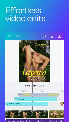
Mobile editing suits quick, contained jobs: resizing or revising a graphic, assembling a basic story, or making a short piece of visual content while travelling. The touchscreen makes direct adjustments feel approachable, and starting from a layout avoids the intimidating blank page that can put casual users off design. I wouldn’t treat a phone as the ideal place for every detailed project, though. Fine spacing, long blocks of text, and repeated small corrections are easier to judge on a larger screen.
A practical mobile workflow is to settle the message before polishing the appearance. I draft the wording first, place the essential text, and only then choose supporting imagery and finishing touches. This is more efficient than repeatedly switching between writing and decoration, particularly when I’m working in a short break. For a long presentation or a design that needs meticulous alignment, I’d rather use a larger display if one is available.
Another small but worthwhile check is to inspect the design at the size people will actually see it. A heading that looks prominent while zoomed in may become hard to read as a compact social graphic. Before sharing, I review the full composition, check that important text has breathing room, and make sure the visual emphasis matches the message. That final pause is more valuable than adding one more effect.
Canva is free to download, though it includes in-app purchases priced from $1.49 to $300.00 per item. I would start by trying the free experience with a specific task rather than assuming every asset or capability is included at no cost. If a feature or item prompts a purchase, I’d decide whether it solves a recurring need or merely looks tempting in the moment. That makes it easier to avoid paying for something I’ll rarely use.
Recovering when an edit or connection goes wrong
Any mobile creative workflow can be interrupted: a connection may falter, the app may need another moment to load, or I may realize I’ve made a change I don’t want. My advice is to work in deliberate stages instead of making a long chain of unreviewed edits. After a meaningful change, pause to inspect the page and confirm that the project is in the state you expect before moving on.
If something seems slow, I avoid tapping repeatedly or changing several settings at once. That can make it harder to tell whether the original action is still processing or whether I’ve created extra work. I’d give the app a moment, check the current design, and retry only the step that did not complete. For an important deadline, I’d also make the final review and sharing step while I still have a dependable connection rather than relying on a last-minute upload.
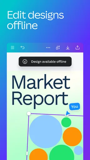
Canva works best when I treat it as a place to assemble and refine a design, not as a substitute for keeping a copy of the information I need. I keep key text—such as event details or a caption—somewhere I can retrieve it if I need to rebuild a small graphic. This is a simple safeguard, not a claim about the app’s offline behavior. The editorial point is straightforward: a network-dependent creative task is less stressful when the essential content is not trapped in a single editing session.
Making sensible choices about data and project size
When I’m mindful of mobile data, I avoid browsing lots of alternatives just for inspiration. I decide what the design needs before opening the editor, then search with a clear purpose and use only the assets that genuinely improve the result. Prompt-based generation and video work are tasks I’d save for a connection I’m comfortable using, especially if I’m not sure how much iteration the idea will take.
Keeping a project simple helps in two ways: it makes the design clearer and reduces needless back-and-forth. For a basic announcement, I don’t need to test multiple visual directions if the audience, wording, and format are already settled. I can make one considered choice, inspect it at a readable size, and stop when the design does its job. This is a useful discipline even when data use is not a concern.
Compared with a dedicated photo editor, Canva’s strength is the broader job of combining text, images, and a ready-made visual structure. A photo editor is a better choice when the main task is detailed image correction. Compared with a professional desktop design program, Canva is easier to approach for routine content, while the specialist tool may be preferable when a project demands unusually exact control. I see it as a practical middle ground: more structured than a basic image editor, less demanding than building a full design from a blank canvas.
Who I’d recommend it to
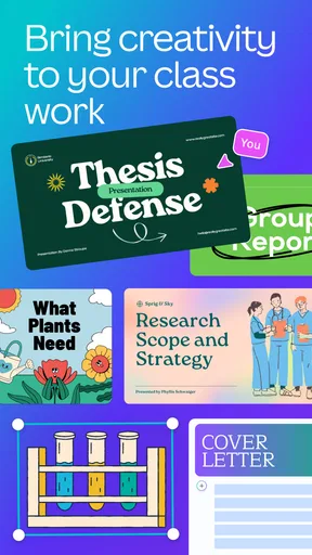
I’d point a small business owner, student, community organizer, or occasional creator toward Canva if they often need clean visual material without wanting to learn a complicated design workflow. It is particularly useful when the same person has to make several kinds of everyday content and wants a familiar place to start. The prompt-based creation angle may also help someone who has a rough concept but needs a visual starting point—provided they are willing to review and refine what appears.
I’d be more cautious about recommending it to someone whose work depends on precise professional production, extensive image retouching, or continuous editing in places with unreliable connectivity. It may still be useful for drafts or quick supporting graphics, but I would not choose it as the only tool for a demanding workflow. Similarly, someone who dislikes template-led design may find that starting from a preset feels limiting rather than helpful.
The app has a 4.8 average from around 28 million ratings, with roughly 104,000 written reviews and over 500 million installs. Those figures reflect broad use, but they don’t tell me whether its workflow suits a particular person. I’d pay more attention to the kind of work I need to make, how often I need to edit on a phone, and whether I’m comfortable relying on a connection for parts of the process.
It is rated Everyone 10+, and its release date was November 27, 2017. Version 2.383.0 requires Android 8.0 or later. For someone deciding whether to try it, the practical point is to check that the phone meets that requirement and then test the app with a real, small project rather than judging it only by its collection of creative options.
My verdict on staying connected
Canva earns its place on my phone because it makes everyday visual work feel manageable: I can begin with a structure, focus on the message, and finish a useful design without approaching the task like a trained designer. Its main compromise is that browsing and more ambitious creative steps are less comfortable when the network is unreliable, while detailed editing can feel cramped on a small screen.
I’d recommend it for quick, template-led design when you can work with a steady connection and are happy to make the final creative decisions yourself. Start with a clear purpose, keep the composition simple, and check the finished design at its intended size. If your work needs exact production control or must continue regardless of connectivity, a specialized editor or desktop tool is the safer choice. For ordinary posters, posts, and short visual projects, though, Canva is a flexible and approachable option rather than a magic button—and that is exactly where I find it most useful.
Pros and cons
Pros
- Templates make it easy to create polished designs quickly.
- The drag-and-drop editor is approachable for beginners.
- Projects can sync across devices with a Canva account.
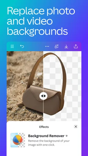
- Built-in tools support photo editing and video creation.
- Many design formats are available for social posts and print.
Cons
- Some premium templates and assets require a paid plan.
- Large projects may feel slow on older devices.
- A Canva account is needed to save and sync work.
- Mobile editing can be fiddly for precise adjustments.
- Export options and quality may vary by design type.


